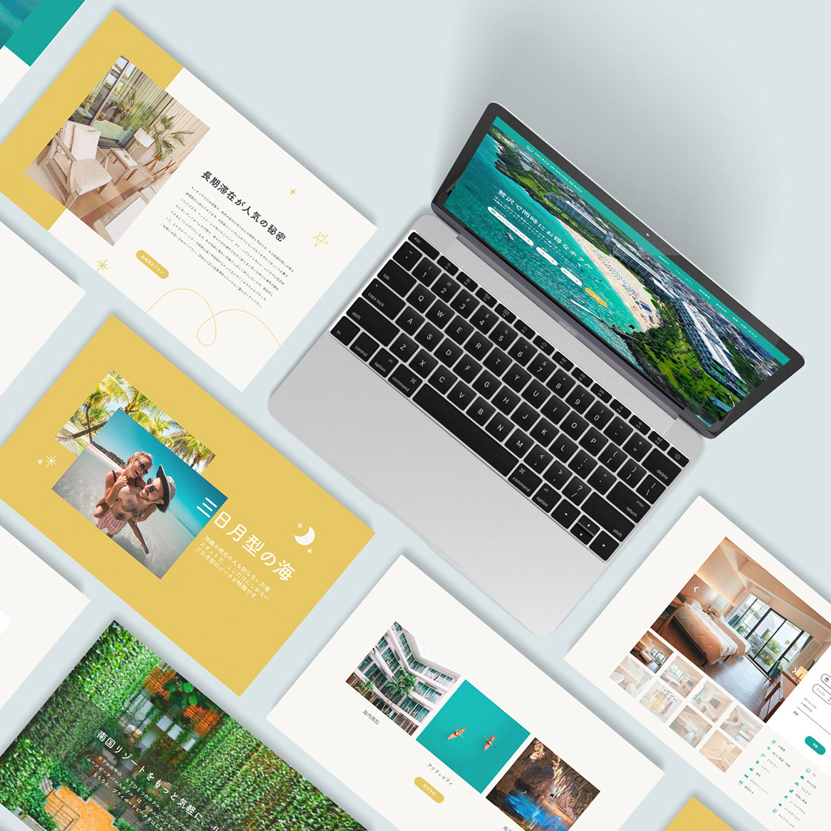
Palace in Moon Beach / パラスインムーンビーチ
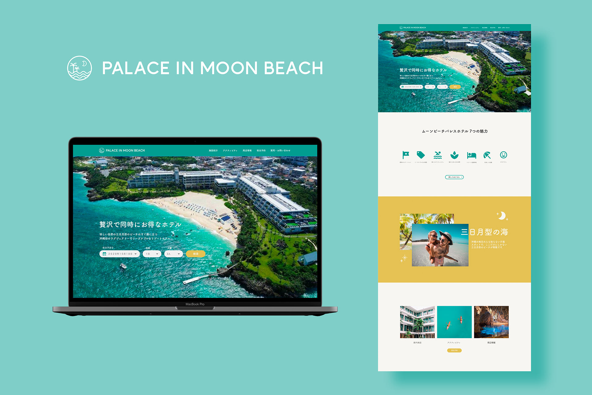
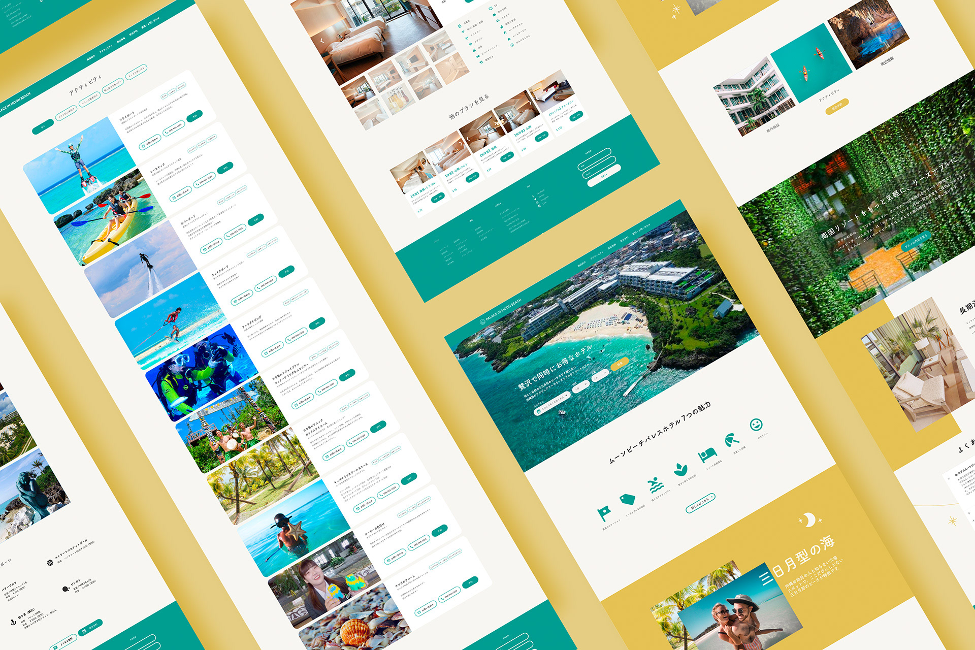
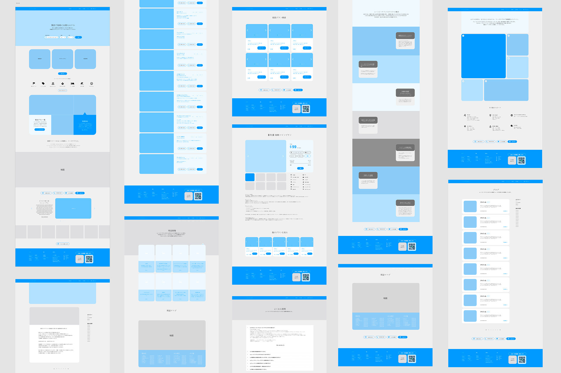
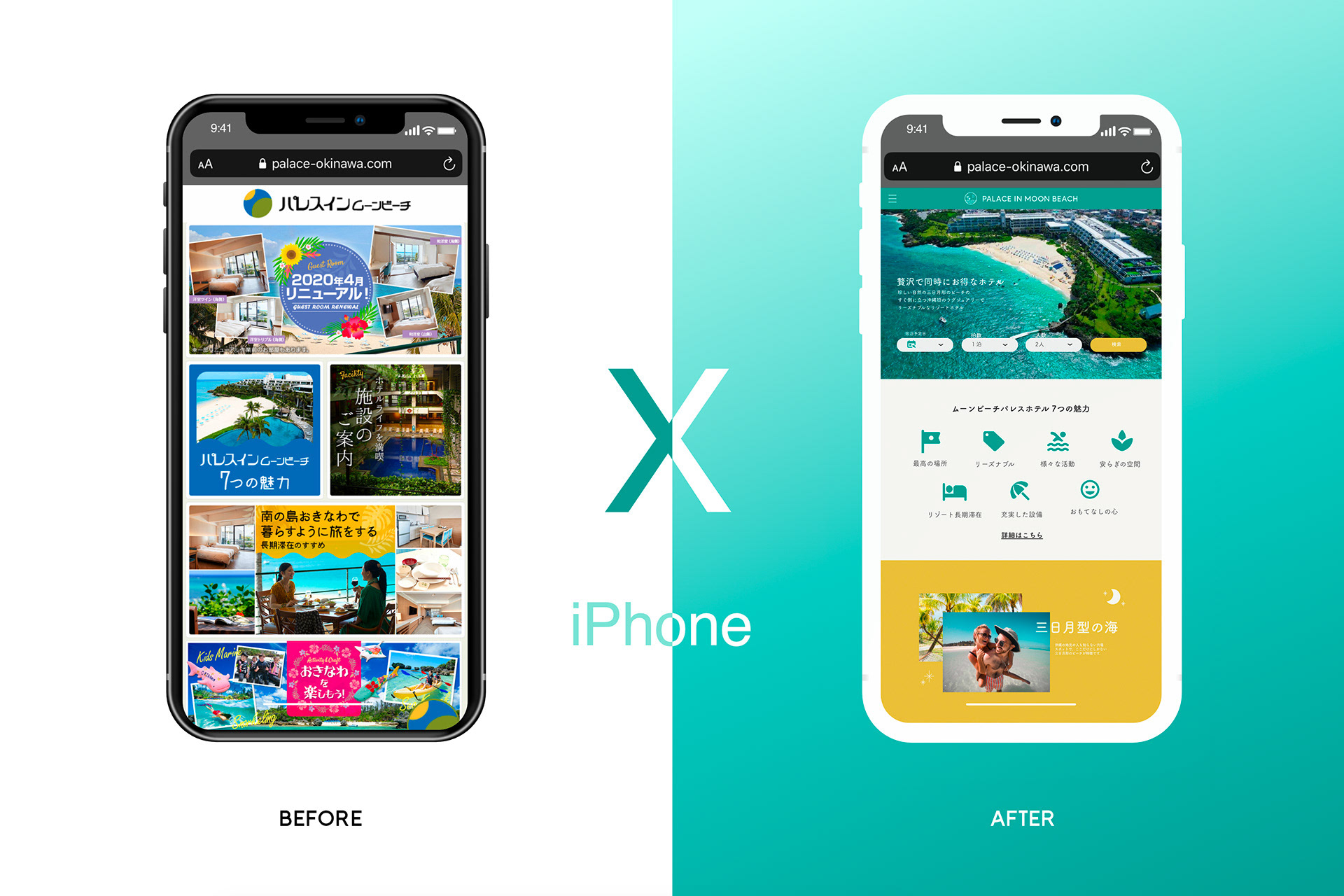
沖縄のパラスインムーンビーチホテルの公式ウェブサイト新リニューアルデザインの考案。贅沢感のあるインテリアやロケーションとは対象に現在のウェブサイトはスーパーのチラシの用にごちゃごちゃしてユーザーにとってナビゲートしにくいと感じたので、情報量は変えずにどういう風にシンプルに高級感を出し仕上げるかにこだわって作成しました。初めに施設のご案内、パレスインムーンビーチ の7つの魅力、活動内容などたくさんの情報がMVに乗っていたので、情報量整理のためにワイヤーフレームから作成しました。三日月型の海が特徴的なホテルなので、三日月の黄色と海のエメラルドグリーンの色をアクセントカラーに使ってデザインを構成しました。このデザインをもっと詳しくみたい方はこちらから。
担当業務:ワイヤーフレーム作成、ウェブデザイン 、ロゴデザイン。
A official website renewal design for the Palais Inn Moon Beach Hotel in Okinawa. For luxurious interiors and locations, I felt that the current website was a little of clutter like a supermarket flyers and difficult for users to navigate, so I decided to make it look simple and luxurious without changing the amount of information. At the beginning, there was a lot of elements on the MV, such as information about the facility, seven attractions of Palace in Moon Beach, and details of activities, so I created a wireframe to organize the amount of information before I start designing. The crescent-shaped sea is a characteristic of the hotel, so I used the yellow of the crescent moon and the emerald green of the sea as accent colors to compose the design. Click here to see more about this design.
My Responsibilities: Wireframe creation, Web design, Logo design.
MENTAIKO FUKUYA / ふくやの明太子
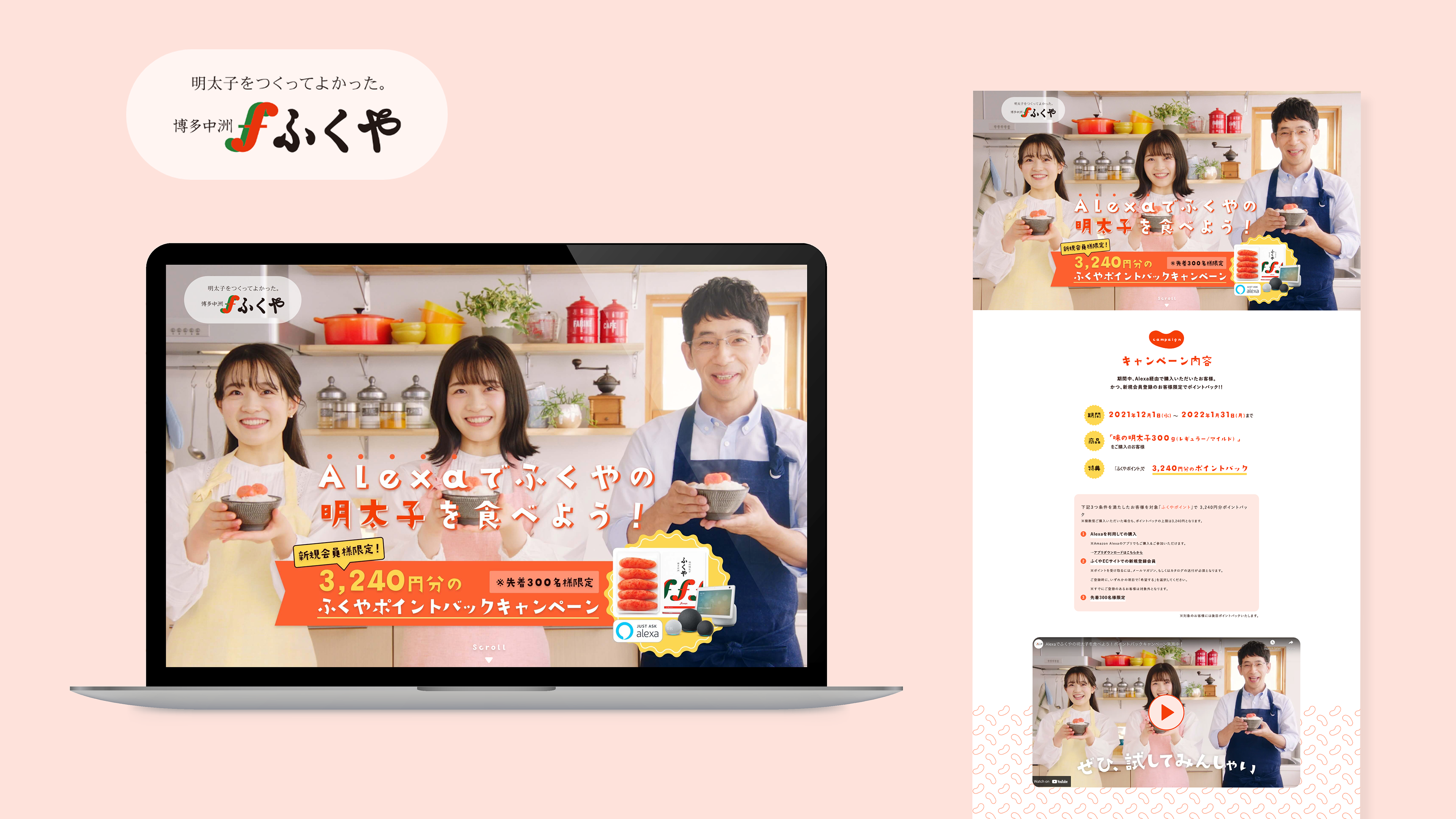
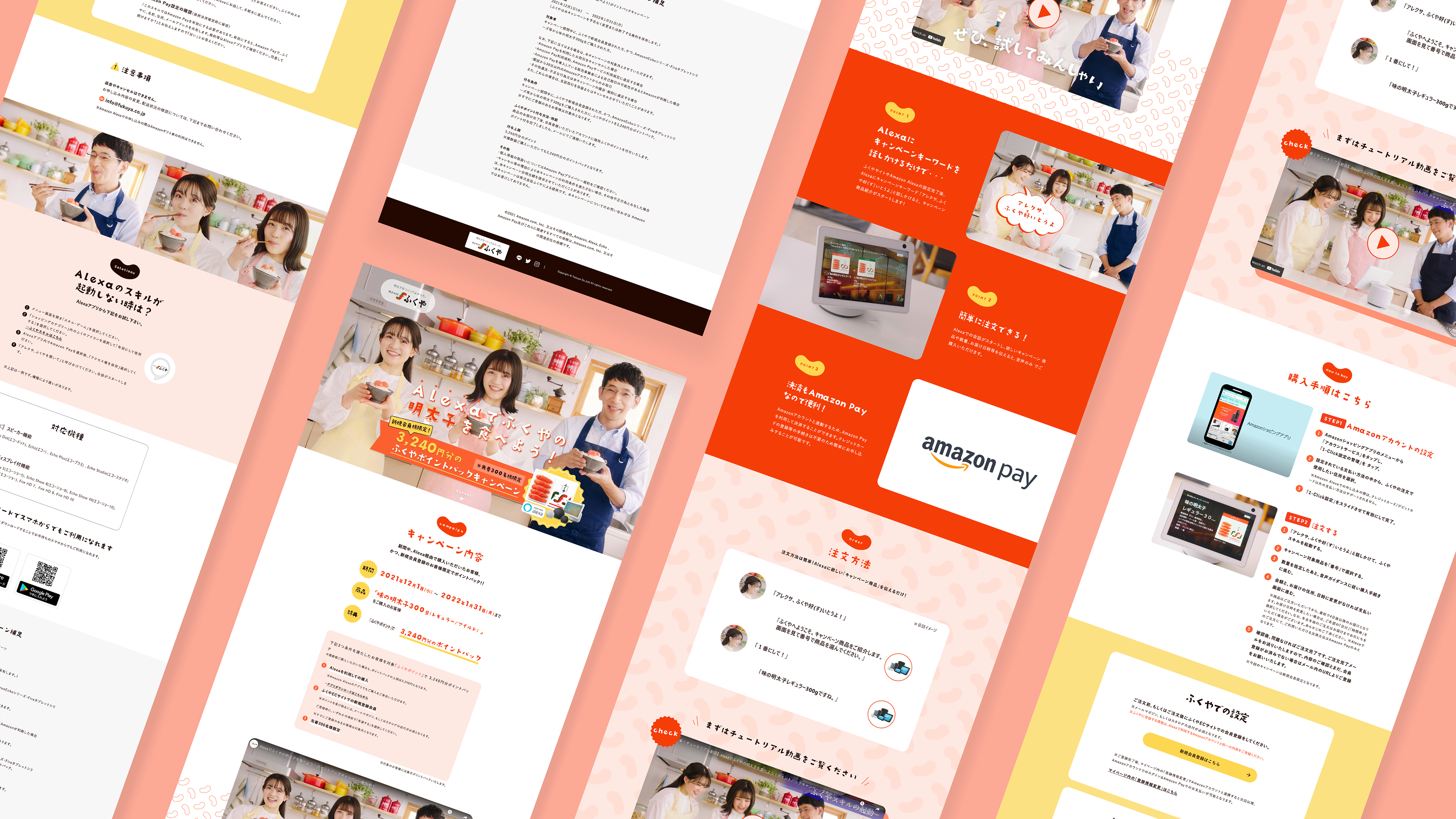
Alexaを使ってふくやの明太子を注文するというキャンペーンのLPデザインを担当しました。いただいたワイヤーフレームをもとに全体的に遊びごごろのあるポップな印象で作成することに努めました。全体的にタイトルをキリギリスのフォントと明太子のイラストを使用して、同じ明太子のイラストで二種類のパターンを作成して背景画像を配置しました。配色は明太子の色である赤、ピンク、赤みのあるオレンジをメイン使用しで、メリハリをつけるために一部に黄色も使用しました。
担当業務:ウェブデザイン、イラスト作成、パターン作成。
公式ウェブサイト:https://www.fukuya.com/lp/amazonalexa/?ld=APJPLPADirect%E3%83%95%E3%82%A1
I was in charge of the Landing Page design for a campaign to order Fukuya's mentaiko using Alexa. Based on the wireframes I received, I tried to create an overall playful and pop impression by using the Kirigirisu font and the illustration of mentaiko for the title, and I created two patterns with the same illustration of mentaiko and placed it as background images. For the color scheme, I mainly used red, pink, and reddish orange, which are the colors of mentaiko, and also used some yellow to add contrast.
My Responsibilities: Web design, illustration creation, pattern creation
Official Website: https://www.fukuya.com/lp/amazonalexa/?ld=APJPLPADirect%E3%83%95%E3%82%A1
LOWER CREATIVE AGENCY / ロウワークリエイティブエージェンシー

スタートアップであるLOWERさんの公式ウェブサイトデザイン担当。実績や作品をメインに見てもらうためにウェブデザインは全体的にオーソドックスで背景色は白と灰色を使用してアイコンとメインビジュアルにはロゴでも使用されている四色(黄色、赤、青、緑)をメインに使用しました。4つのメインのサービス(YOUTUBE広告運営代行、リスティング広告運営代行、Web,グラフィック作成、動画広告作成)をメインビジュアルで分かるようにして欲しいという希望がクライエントからあったので、LOWERのロゴの形と色を保ちながら写真とテキストをはめて作成しました。
担当業務:ウェブデザイン
Official website design for startup company, LOWER. The client requested that the four main services (YouTube advertising management agency, listing advertising management agency, Web & graphic Design, video advertisement ) are the main focus on the main visual in top page, so I used the shape of the official LOWER logo and I created the design by inserting photos and text while carefully keeping its colors and shapes.
My Responsibilities: Web design.
141 LIVE
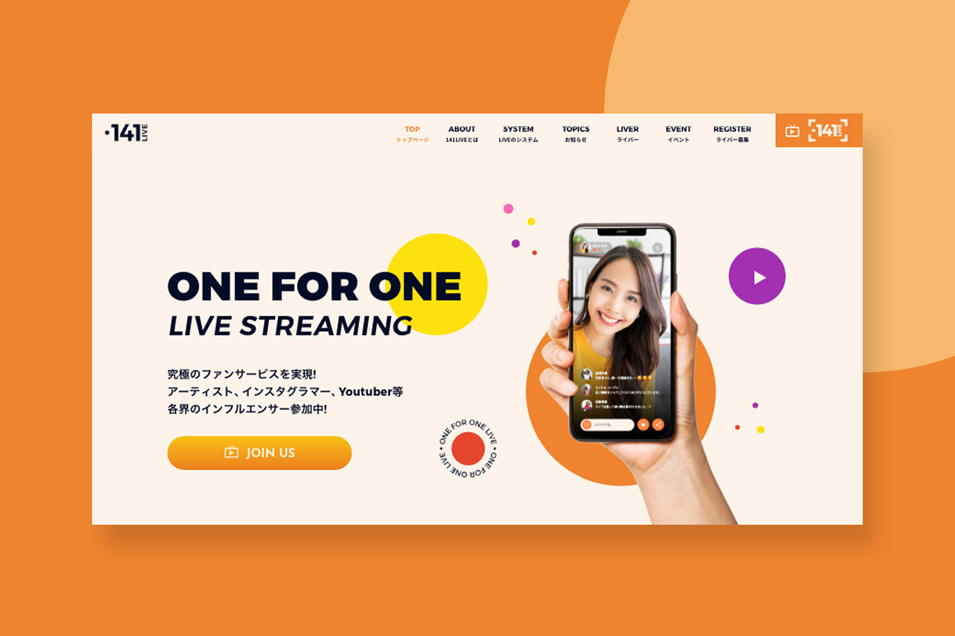
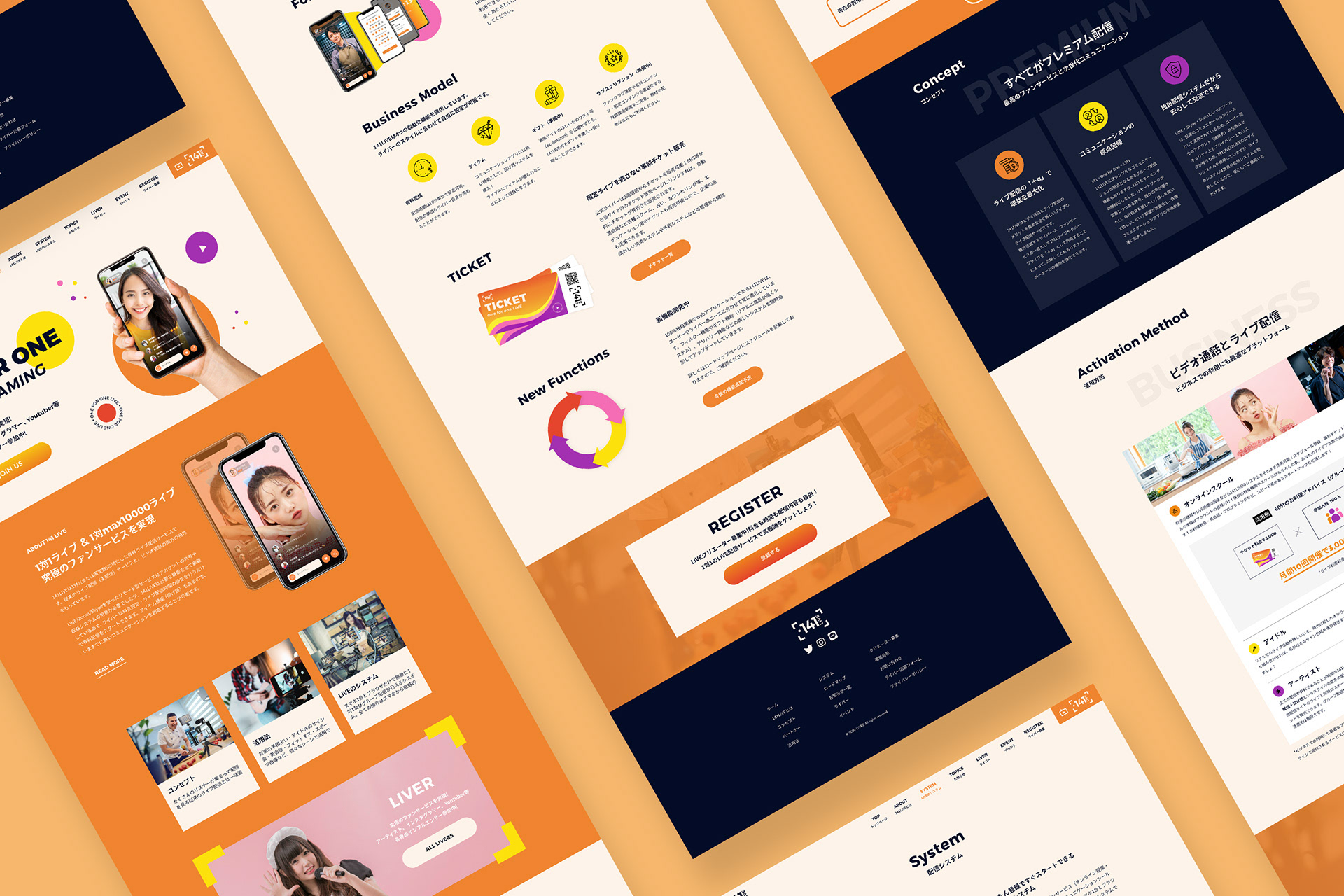
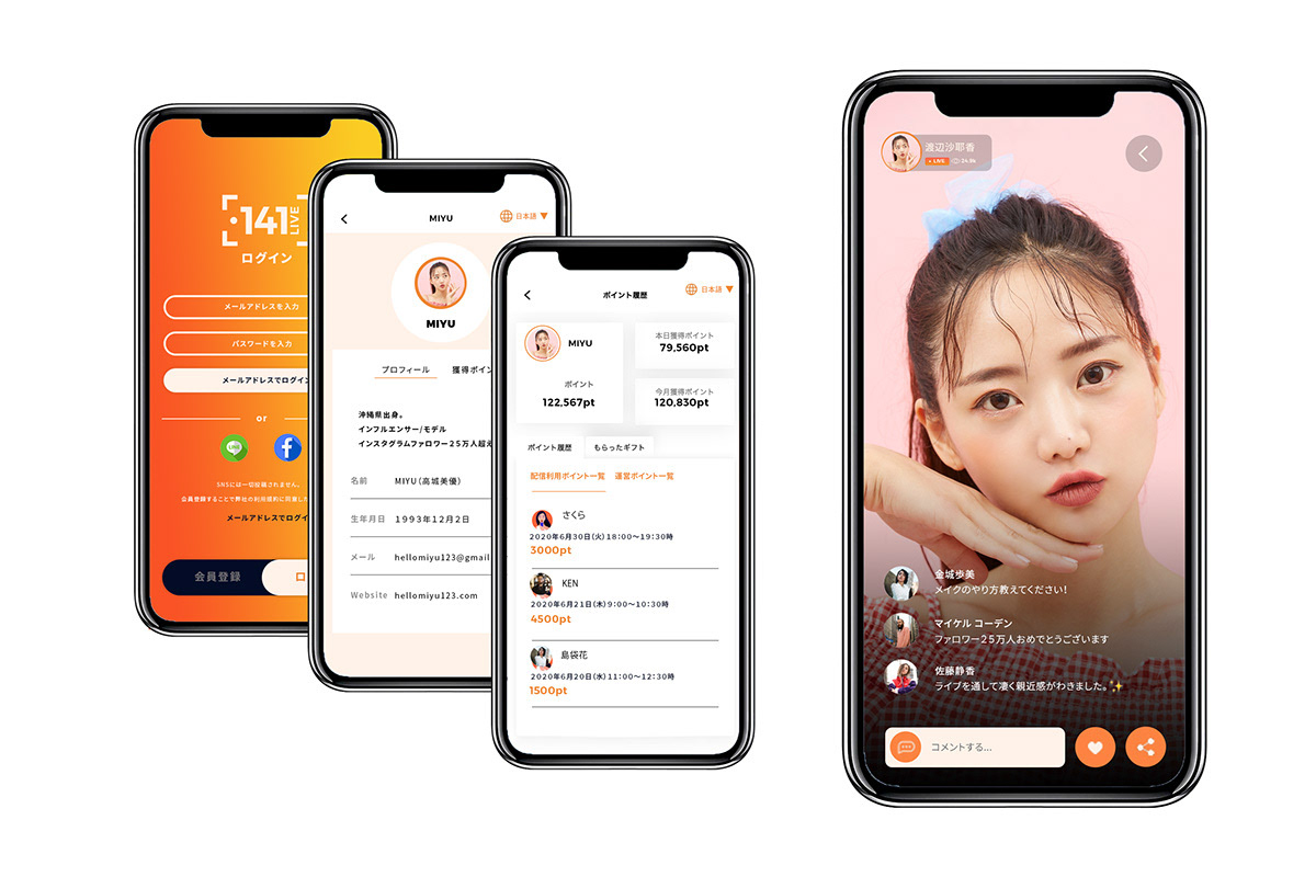
141LIVEは1対1で有料配信するプライベート感満載のライブ配信プラットフォームで、ロゴ、ウェブサイト、一部アプリのリニューアルデザインを担当しました。ロゴを作る際にライブ、生放送という印象をシンボルで表したかったので、録音サインのフレームをメインに使って作成しました。デザインは変えてもブランドの印象を保つためにアクセントカラーは元からあった色(黄色、オレンジ、紫、ピンク)をメインに使用して、全体的に楽しくカラフルな印象で仕上げました。統一感を出すためにストックイラストを使う代わりに一部、TICKETやNEW FUNCTIONSのイラストもイラストレーターで一から作成しました。このデザインをもっと詳しくみたい方はこちらから。
担当業務:ウェブデザイン、アプリ一部デザイン、メインビジュアル作成、イラスト。
O141LIVE is a one-on-one live private distribution platform, and I was in charge of the renewal design of the logo, website, and some apps design. For the logo, I wanted to express the impression of a live broadcast , so I created the recording frame inspired logo. Originally 141 LIVE used many warm colors in their previous website, so I used the accent 4 colors (yellow, orange, purple, and pink) to maintain the impression of the brand and to create fun and colorful theme overall. Instead of using stock illustrations, I drew illustrations of TICKET and NEW FUNCTION from scratch with an illustrator to create a sense of unity. Click HERE for more about this design.
My Responsibilities: Web design, application part design, main visual production, illustration.
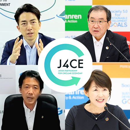
Japan Partnership for Circular Economy (J4CE) / 循環経済パートナーシップ
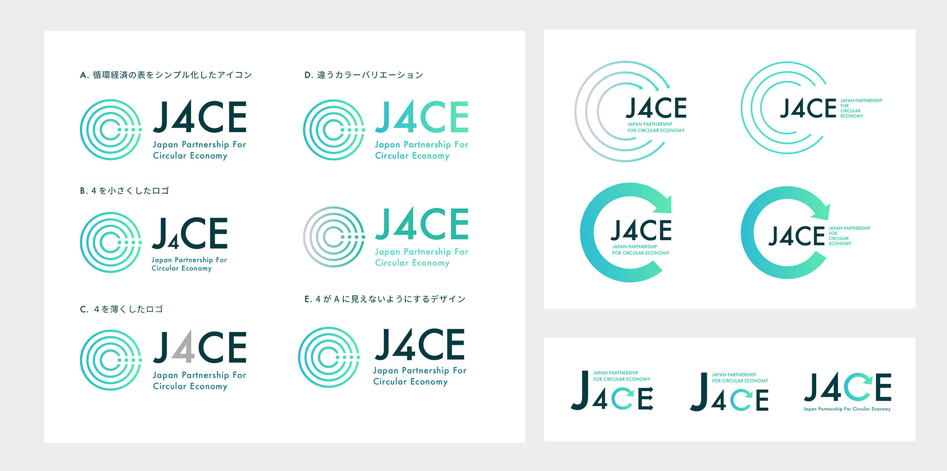
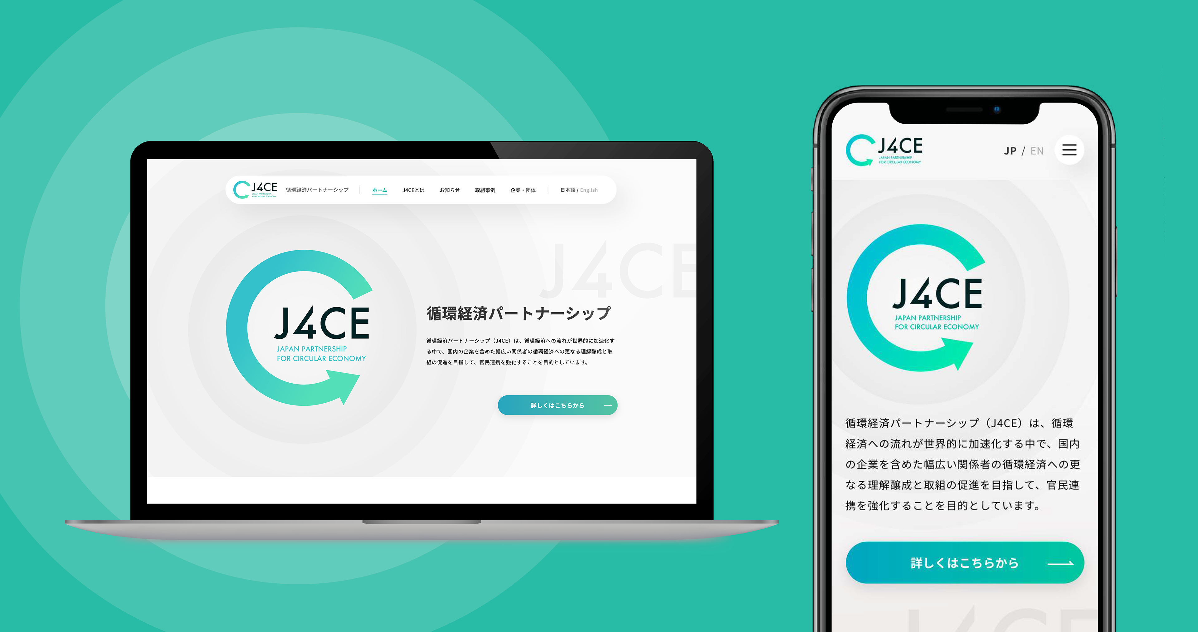
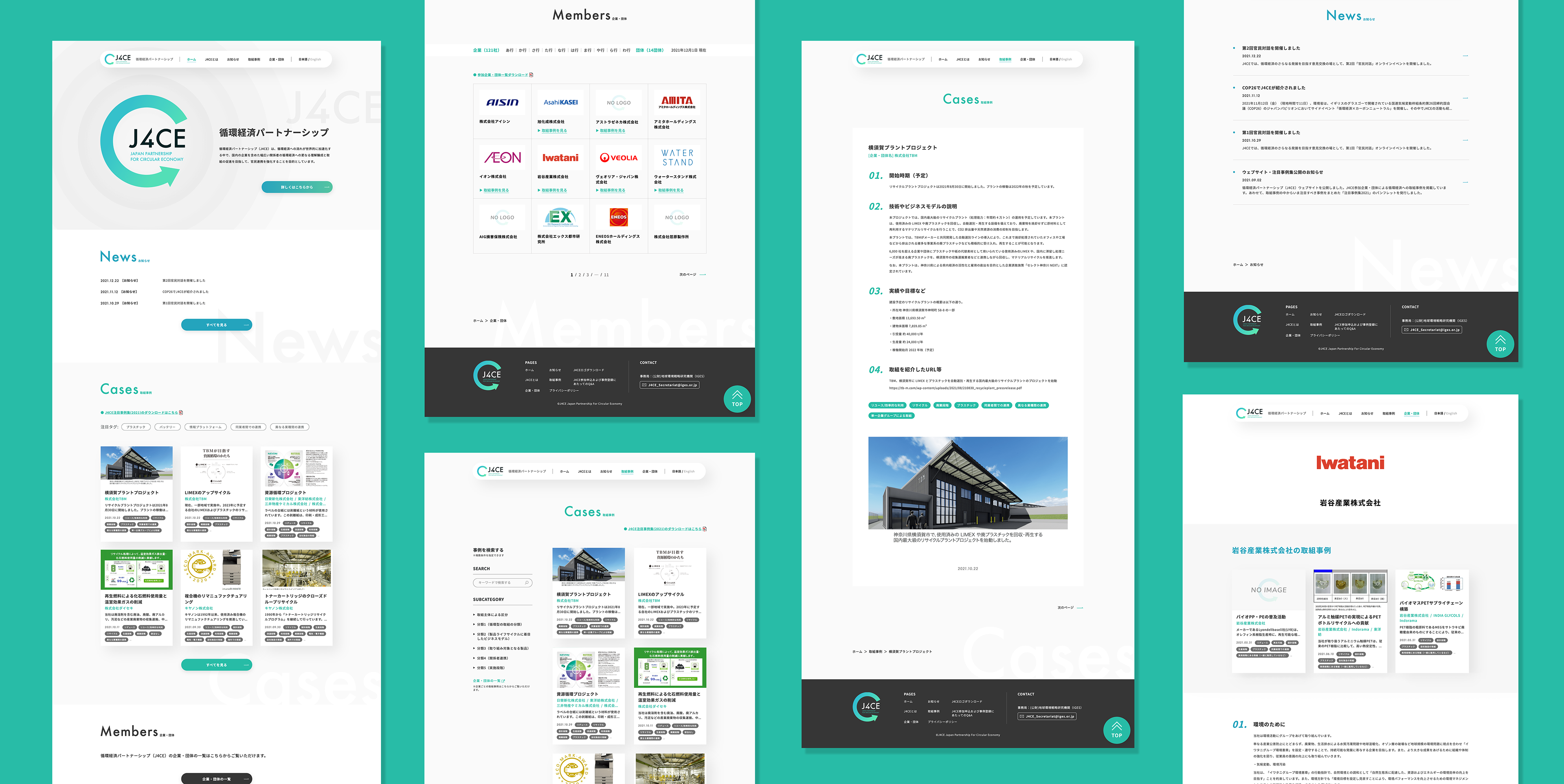
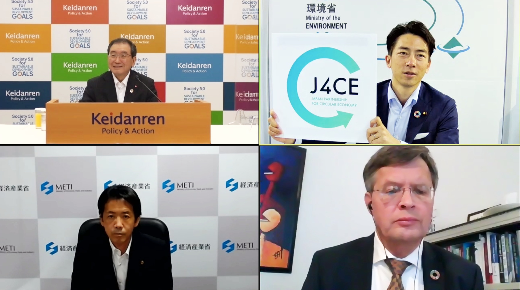
循環経済パートナーシップ(J4CE)のロゴデザインとウェブデザインを担当しました。経済が循環するというシンボルで丸い矢印のロゴでいくつか提案した中から小泉大臣に選んでもらい、最終的なロゴはオンライン発表式でも公表されました。テレビでも報道されたオンライン発表式には、宗清経産大臣政務官、十倉経団連会長が出席し、バルケネンデ・オランダ王国前首相より祝辞をいただきました。ウェブサイトはたくさんの政府の方や世界中の方がご覧になられるので、シンプルかつメタリック感を出して欲しいと要望でしたので、灰色、文字の影、光の反射のグラデュエーションで表現しました。このデザインをもっと詳しくみたい方はこちらから。
I was in charge of the logo design and web design for the Japan Partnership for Circular Economy (J4CE). I prepared several logo designs that symbolizes the circulation of the economy with a round arrow design , and Minister Koizumi chose the final logo, which was announced at the online announcement ceremony. I tried to keep the website simple and formal so it is easier to navigate for many government officials and people from all over the world. It was requested to use gray color with metallic effects, so I create the design with a gradation of light reflections, gray accent colors, shadows of letters to emphasize the feeling of metallic . Click HERE to learn more about this design.
My Responsibilities: Web design, Logo Design, Brochure
Official Website: https://j4ce.env.go.jp/
Official Website: https://j4ce.env.go.jp/
ハチはる HACHIHARU SHIBUYA meets AKITA
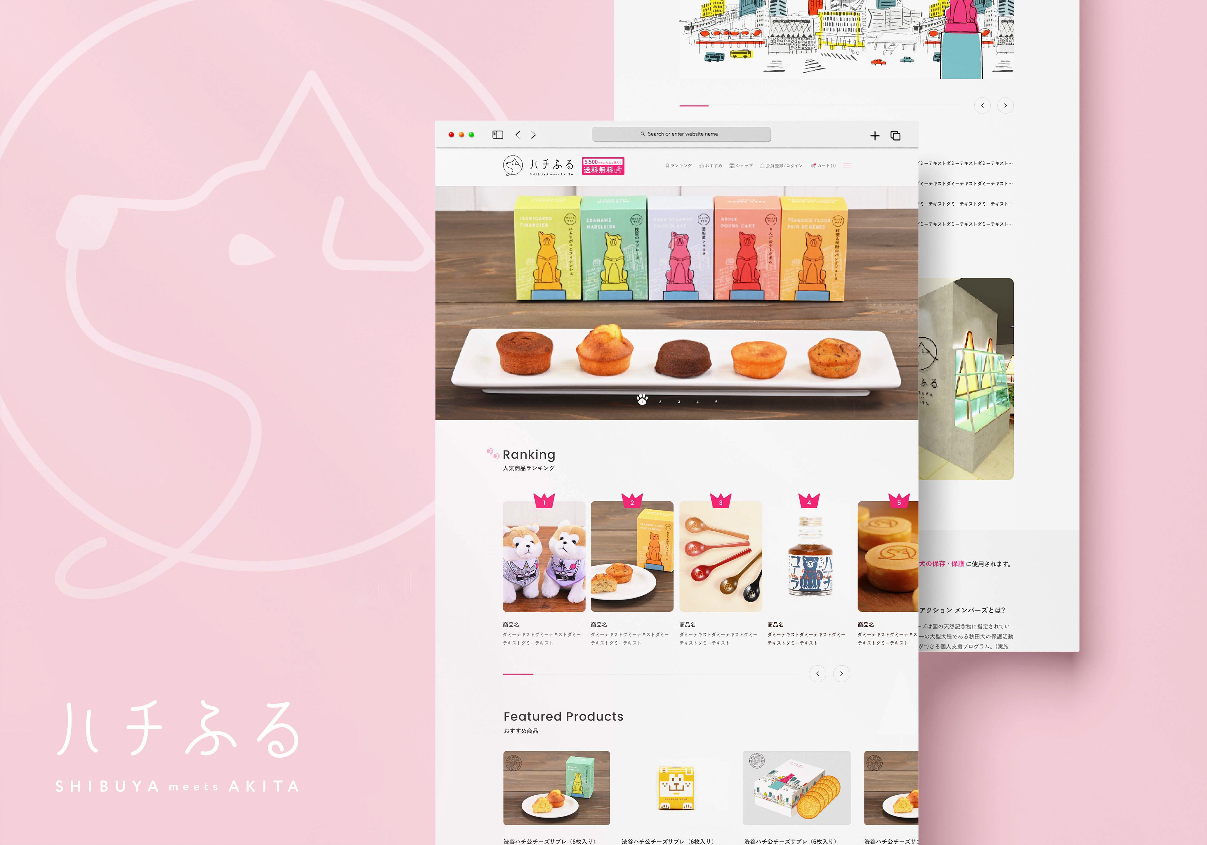
渋谷にできたばっかりのハチ公のお土産ショップのECサイトのデザインを担当させていただきました。アクセントカラーはショッキングピンクで、背景と背景イラストの杉の木は店舗のデザインと共通のグレーで統一しました。スクロールダウンするとピンクの犬の足がついて来たり、メインビジュアルのバナーのページ番号も足跡のイラスト、ランキングの王冠など可愛くてさりげないイラストにもこだわりました。
I was in charge of designing the e-commerce site for the newly opened Hachiko souvenir shop in Shibuya. The accent color is shocking pink, and added the grey background color and the cedar tree illustration inspired by the store design. My favorite part of the design is when you scroll down, you'll see a pink dog's paw following along with you. I put a lot effort in small details such as the paws shaped page number of the banner in the main visual and crowns in ranking section.
My Responsibilities: Web design Official Website: https://www.hachifull.jp/
RYOMA / りょうま
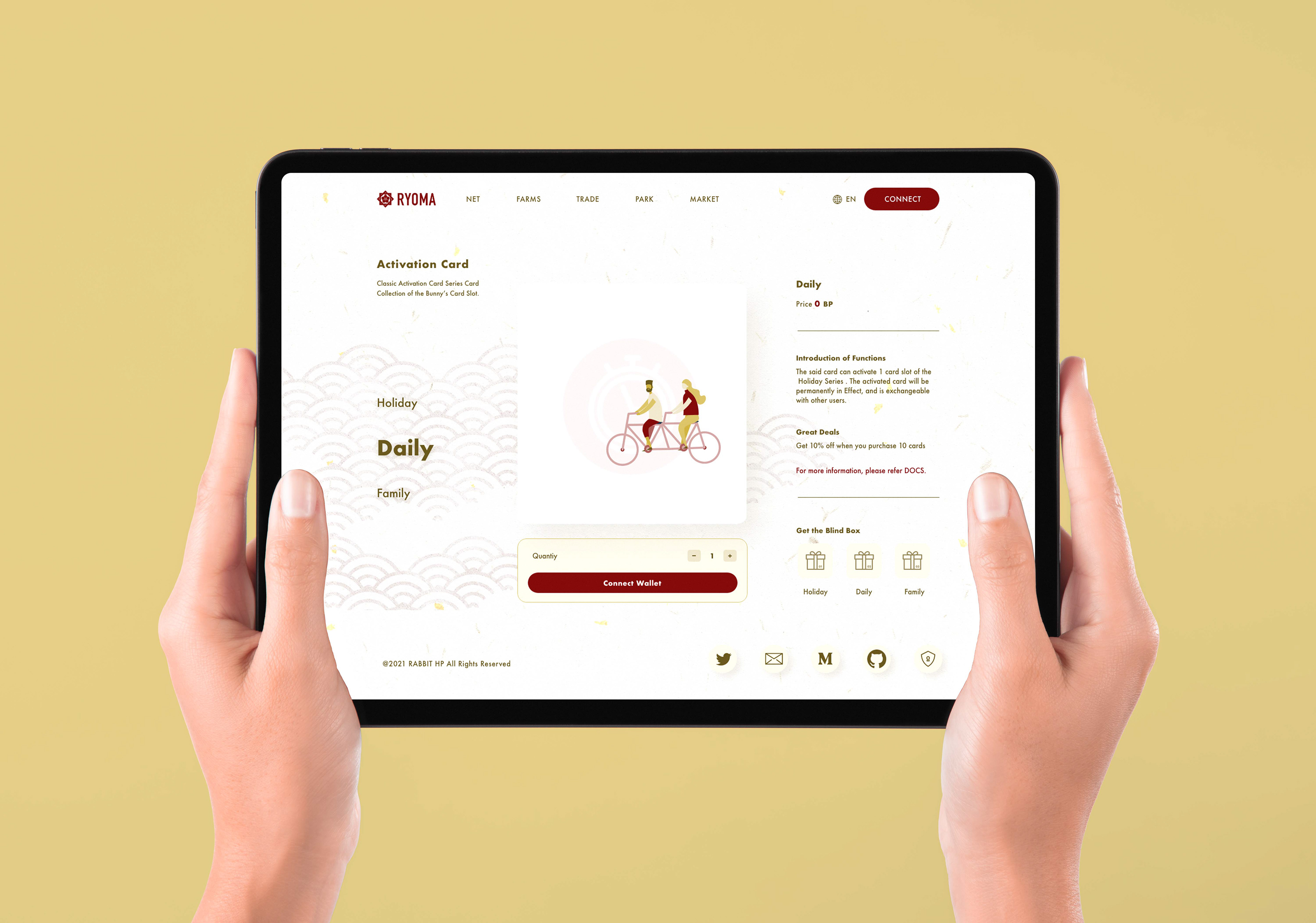
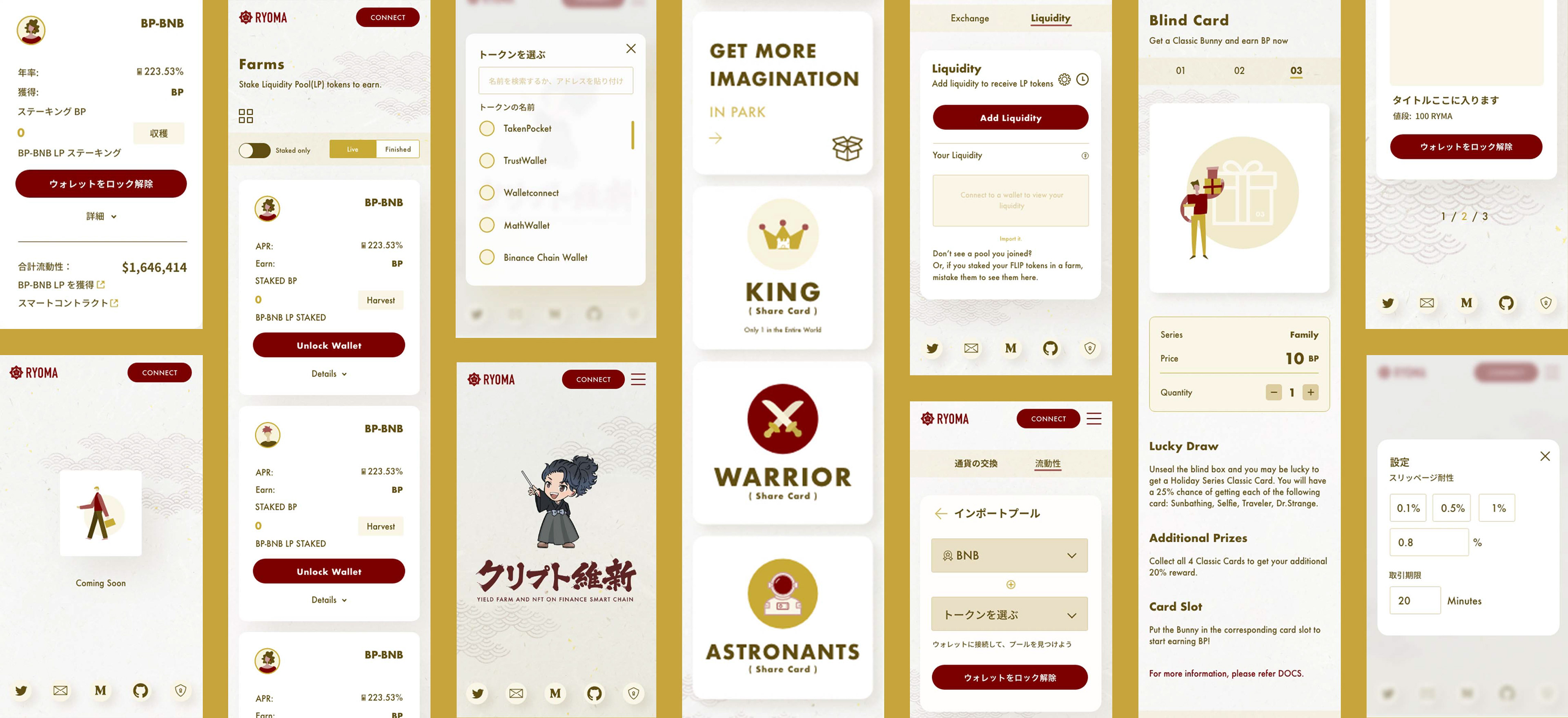
RYOMAはクライエントのリクエストで通り黄土色と紅葉色のアクセントカラーを使い、さりげなく背景に和風のパターンを置き、クリプト関連事業だが和風感を保てるように努力しました。公式ウェブサイトとスマホのデザインを担当しました。
担当業務:ウェブデザイン 、UIデザイン。
The client requested to use ocher and autumnal colors as accent colors, and I placed a Japanese-style pattern in the background. Although it is a crypto-related business, I tried to maintain a Japanese style. I was in charge of designing the official website and UI design.
My Responsibilities: Web design, UI design.