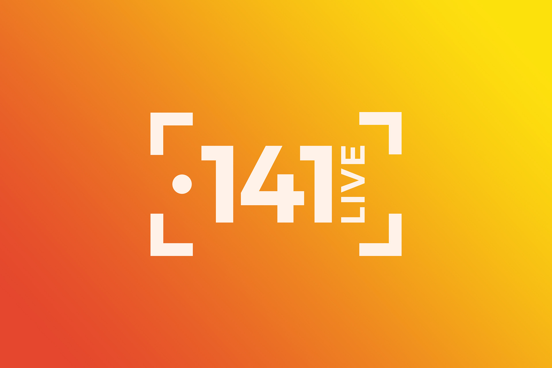
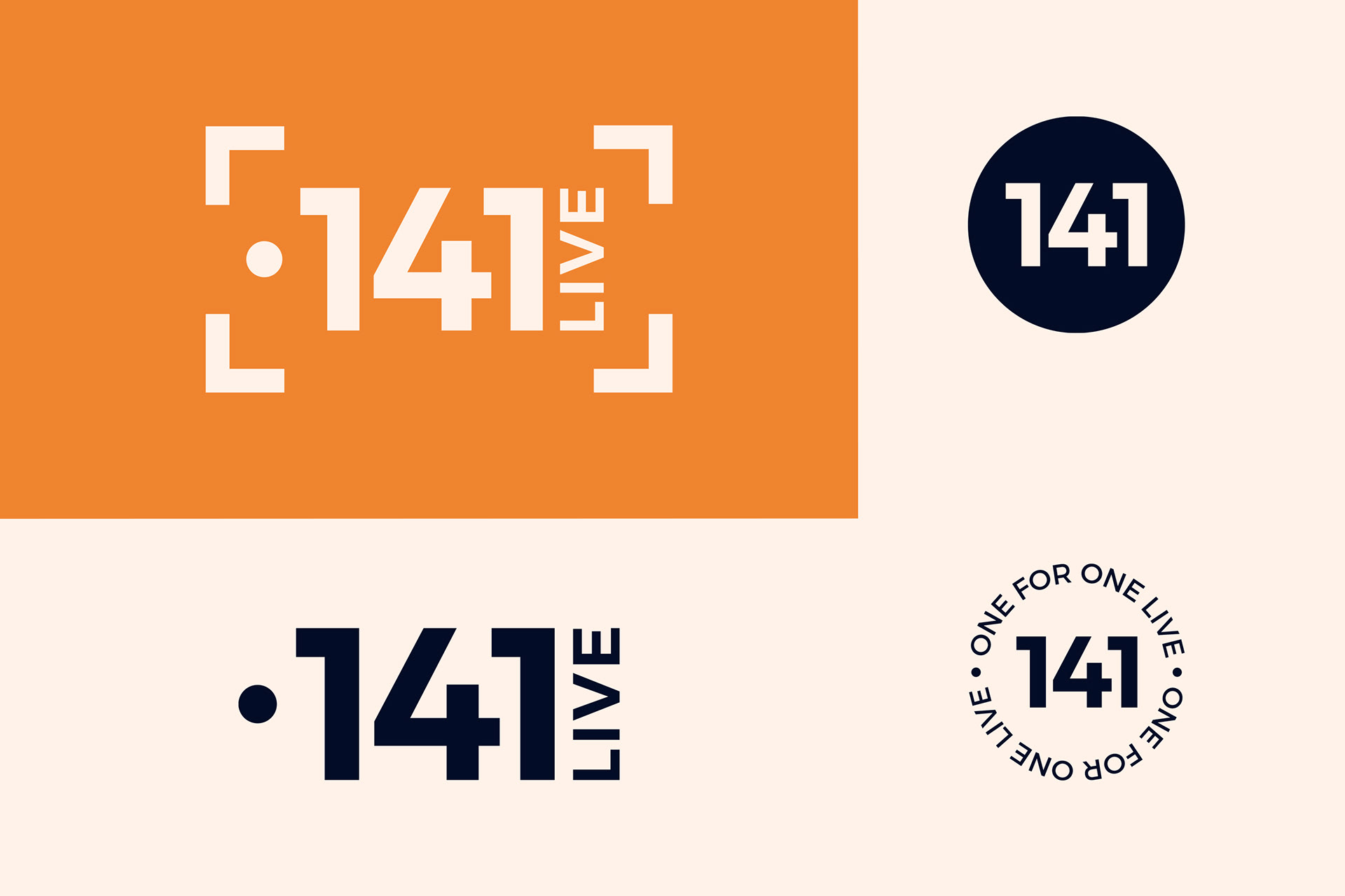
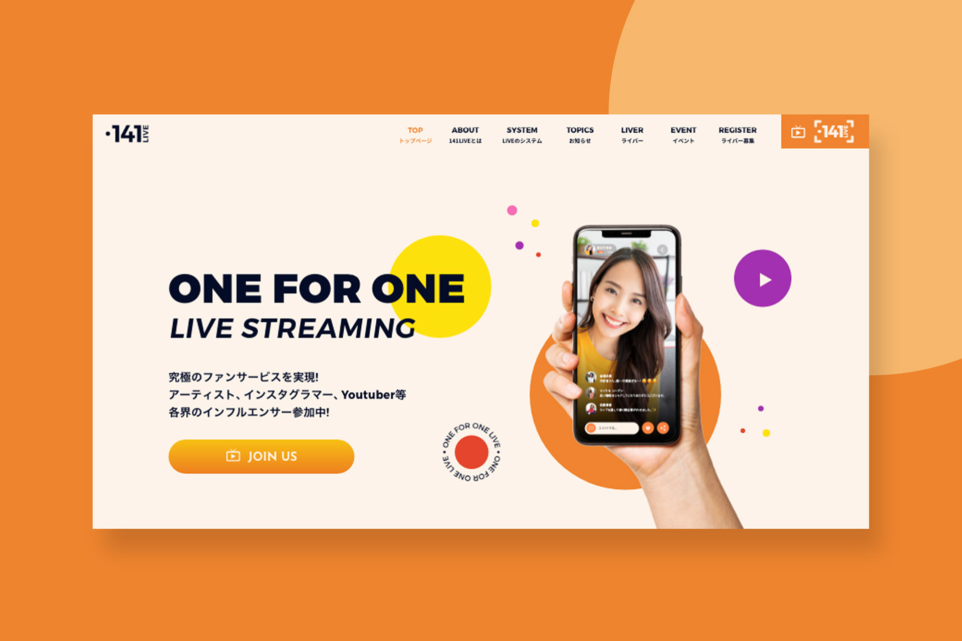
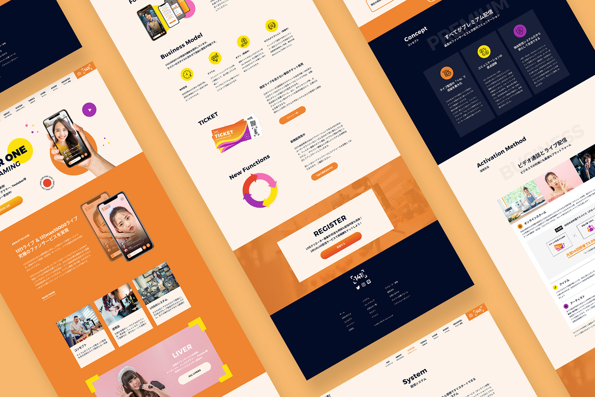
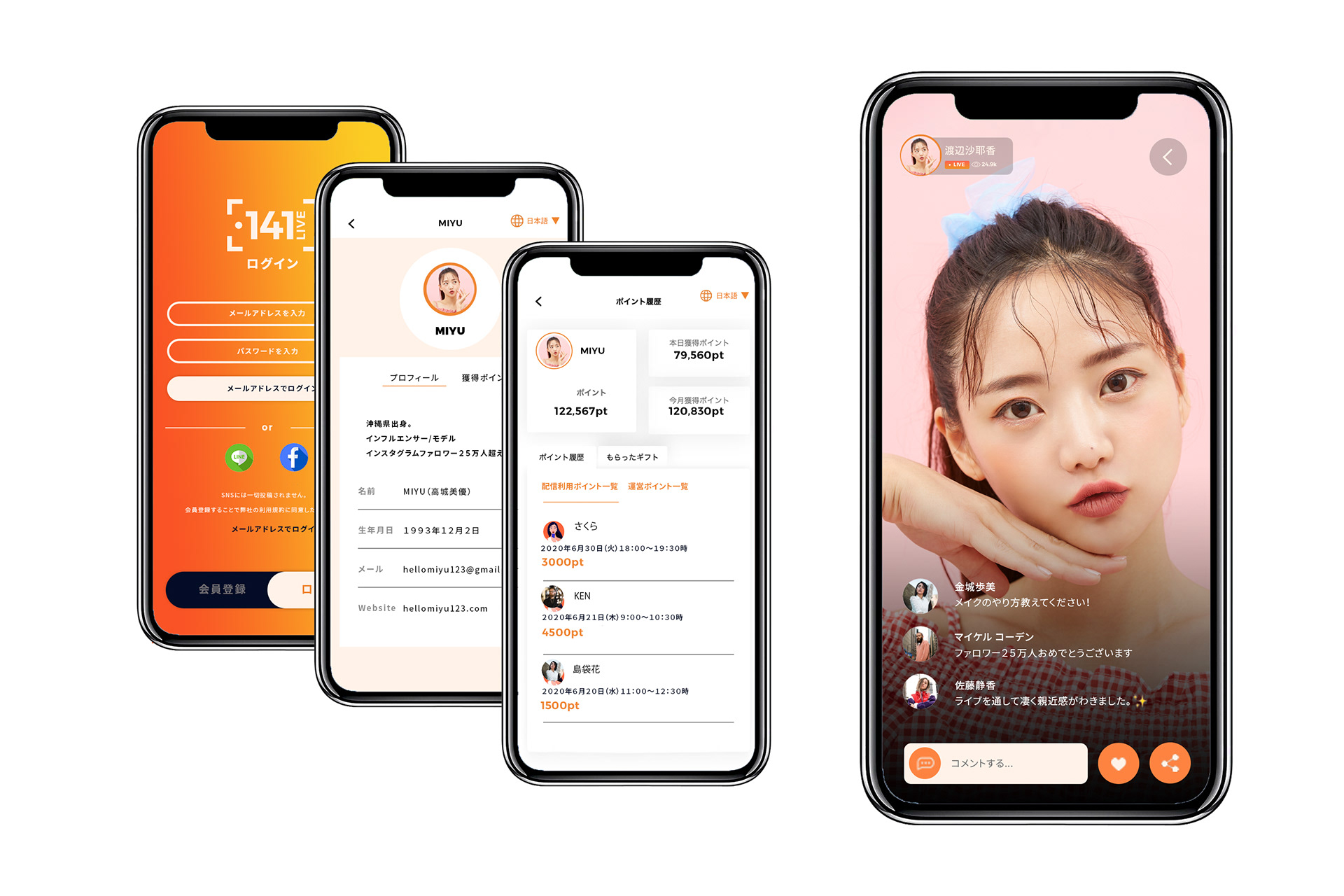
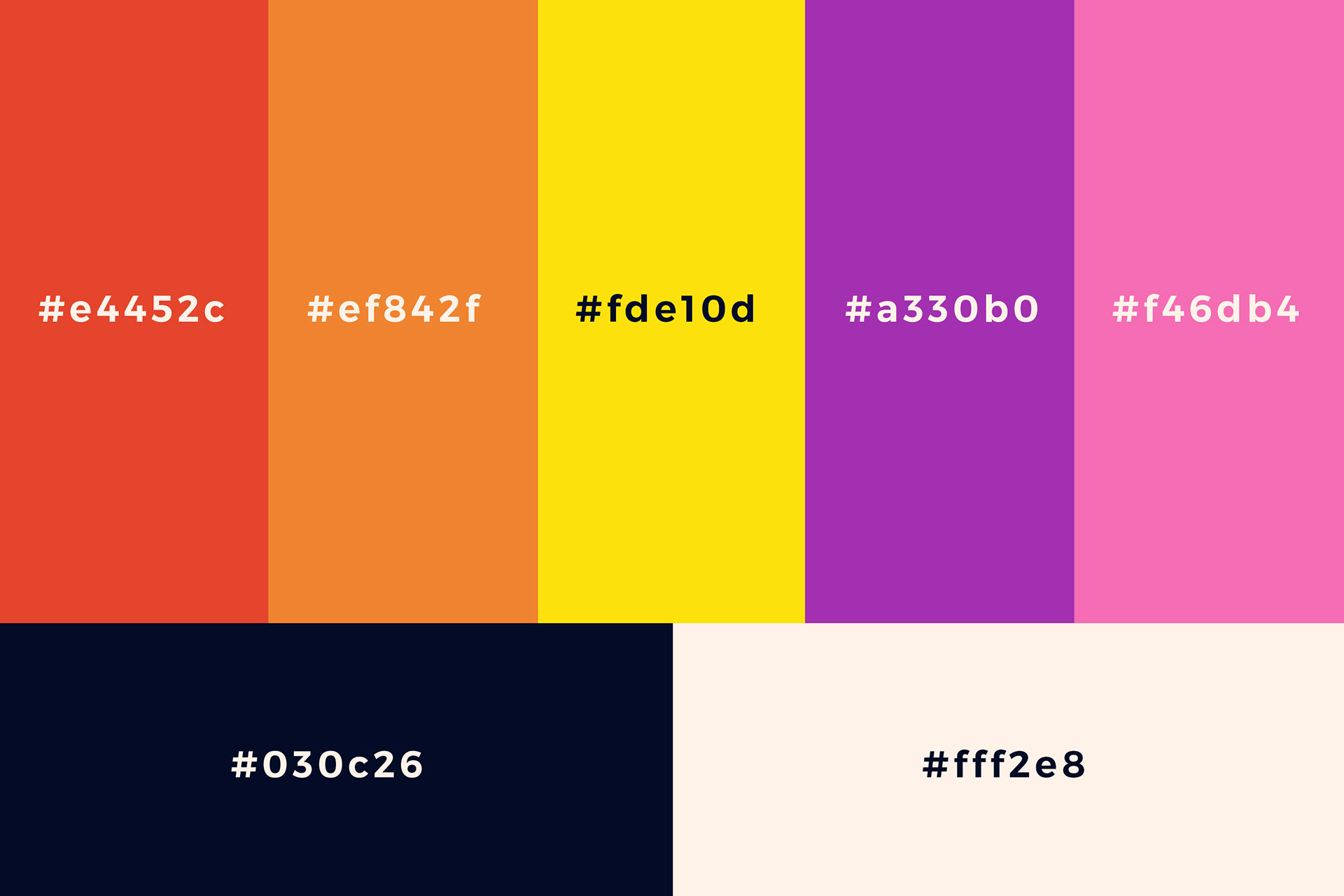
141LIVEは1対1で有料配信するプライベート感満載のライブ配信プラットフォームで、ロゴ、ウェブサイト、一部アプリのリニューアルデザインを担当しました。ロゴを作る際にライブ、生放送という印象をシンボルで表したかったので、録音サインのフレームをメインに使って作成しました。デザインは変えてもブランドの印象を保つためにアクセントカラーは元からあった色(黄色、オレンジ、紫、ピンク)をメインに使用して、全体的に楽しくカラフルな印象で仕上げました。統一感を出すためにストックイラストを使う代わりに一部、TICKETやNEW FUNCTIONSのイラストもイラストレーターで一から作成しました。このデザインをもっと詳しくみたい方はこちらから。
担当業務:ウェブデザイン、アプリ一部デザイン、メインビジュアル作成、イラスト。
O141LIVE is a one-on-one live private distribution platform, and I was in charge of the renewal design of the logo, website, and some apps design. For the logo, I wanted to express the impression of a live broadcast , so I created the recording frame inspired logo. Originally 141 LIVE used many warm colors in their previous website, so I used the accent 4 colors (yellow, orange, purple, and pink) to maintain the impression of the brand and to create fun and colorful theme overall. Instead of using stock illustrations, I drew illustrations of TICKET and NEW FUNCTION from scratch with an illustrator to create a sense of unity. Click HERE for more about this design.
My Responsibilities: Web design, application part design, main visual production, illustration.